Waterfall chart is a good way to show changes overtime. One good example is showing how business revenue is growing in different components over a certain period so that you can have an overview of growth drivers.

Here is a use case where I want to illustrate how ARR is growing in the past year and the formula is very straightforward:
Beginning ARR + New ARR + Expansion ARR – Churn ARR = Ending ARR
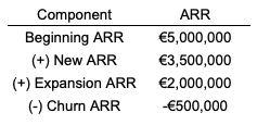
Following the instruction from Google, I can easily make a waterfall chart with some customisation:
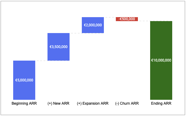
The question is I would like to change the bar colour in the waterfall so that people can easily see which part is New ARR and which is Expansion ARR, as shown below, but Google sheets won’t allow me to do so in an obvious way.
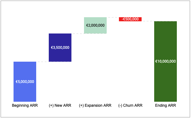
The workaround I find is a bit tricky but it gives me a lot customisation options. The idea is to use stacked waterfall chart with multiple series. An example sheet is shared in the end of this post so you can copy it directly to see what exactly the setups are and start working from there!
Table of Contents
Step 1: transforming the data into different series

Step 2: applying stacked waterfall chart with multiple series
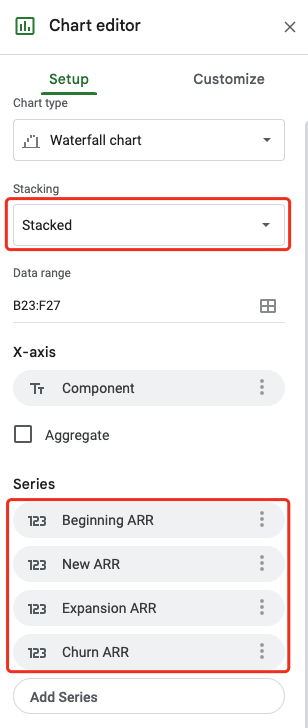
And it may look like this after the second step:
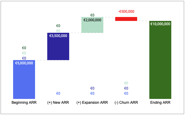
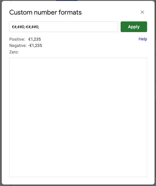
Step 3: hiding empty (zero) data labels from the chart by customising number format
Since I want to keep positive numbers and negative numbers but hide zero numbers, here is the number format I can use (€#,##0;-€#,##0;):
Step 4: changing the fill colour of each bar accordingly
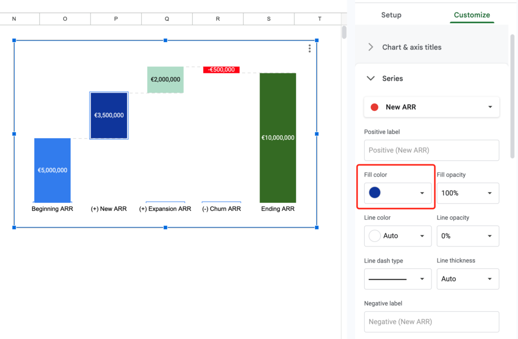
Feel free to copy the example sheet and make your own waterfall chart with such customisation options!
Are there any limitations or considerations I should be aware of when customizing the bar colors in a waterfall chart?
Thank you, Henry! This was super helpful, another thing that should be very easy but isn’t
Super helpful, thank you for sharing!
Trusted by Iraq’s top industries, BWER Company provides innovative weighbridge systems, enabling seamless load monitoring and weight compliance for transport, construction, and agriculture sectors.
BWER Company provides Iraq’s leading-edge weighbridge solutions, designed to withstand harsh environments while delivering top-tier performance and accuracy.