Waterfall chart is a good way to show changes overtime. One good example is showing how business revenue is growing in different components over a certain period so that you can have an overview of growth drivers.
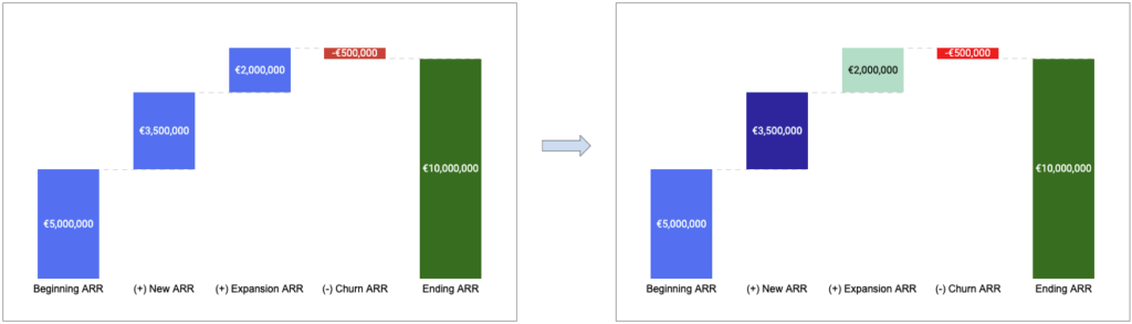
Here is a use case where I want to illustrate how ARR is growing in the past year and the formula is very straightforward:
Continue reading