“A receiver operating characteristic curve, or ROC curve, is a graphical plot that illustrates the diagnostic ability of a binary classifier system as its discrimination threshold is varied. The ROC curve is created by plotting the true positive rate against the false positive rate at various threshold settings.” – Wikipedia
Simulation can be very useful for us to understand some concepts in Statistics, as shown in Probability in R. Here is another example that I used simulation to understand ROC Curve and AUC, the metrics in classification models that I had never fully understand.
Table of Contents
Data
The simulation in this post was inspired by OpenIntro Statistics and the email dataset I used can be found in openintro package.
library(tidyverse)

# For the email dataset
library(openintro)

# For ROC curve plots
library(tidymodels)
email
#> # A tibble: 3,921 x 21
#> spam to_multiple from cc sent_email time image attach
#> <dbl> <dbl> <dbl> <int> <dbl> <dttm> <dbl> <dbl>
#> 1 0 0 1 0 0 2012-01-01 07:16:41 0 0
#> 2 0 0 1 0 0 2012-01-01 08:03:59 0 0
#> 3 0 0 1 0 0 2012-01-01 17:00:32 0 0
#> 4 0 0 1 0 0 2012-01-01 10:09:49 0 0
#> 5 0 0 1 0 0 2012-01-01 11:00:01 0 0
#> 6 0 0 1 0 0 2012-01-01 11:04:46 0 0
#> 7 0 1 1 0 1 2012-01-01 18:55:06 0 0
#> 8 0 1 1 1 1 2012-01-01 19:45:21 1 1
#> 9 0 0 1 0 0 2012-01-01 22:08:59 0 0
#> 10 0 0 1 0 0 2012-01-01 19:12:00 0 0
#> # … with 3,911 more rows, and 13 more variables: dollar <dbl>, winner <fct>,
#> # inherit <dbl>, viagra <dbl>, password <dbl>, num_char <dbl>,
#> # line_breaks <int>, format <dbl>, re_subj <dbl>, exclaim_subj <dbl>,
#> # urgent_subj <dbl>, exclaim_mess <dbl>, number <fct>These data represent incoming emails for the first three months of 2012 for an email account. The variables are explained clearly here.
Logistic Regression Model
Basically the research question is to develop a valid logistic regression to predict if an email is spam. This post focuses on the ROC curve simulation so we will just jump to the final refined model as shown below.
# data preparation
df <- email %>%
  mutate(across(c(to_multiple, cc, image, attach, password, re_subj, urgent_subj), ~if_else(.x > 0, "yes", "no"))) %>%
  mutate(format = if_else(format == 0, "Plain", "Formated"))

# fit logistic regression model
g_refined <- glm(spam ~ to_multiple + cc + image + attach + winner
                       + password + line_breaks + format + re_subj
                       + urgent_subj + exclaim_mess, data=df, family=binomial)

summary(g_refined)
#>
#> Call:
#> glm(formula = spam ~ to_multiple + cc + image + attach + winner +
#>     password + line_breaks + format + re_subj + urgent_subj +
#>     exclaim_mess, family = binomial, data = df)
#>
#> Deviance Residuals:
#>     Min       1Q   Median       3Q      Max
#> -1.7389  -0.4640  -0.2162  -0.1008   3.7746
#>
#> Coefficients:
#>                  Estimate Std. Error z value Pr(>|z|)
#> (Intercept)    -1.7594438  0.1177345 -14.944  < 2e-16 ***
#> to_multipleyes -2.7367955  0.3155876  -8.672  < 2e-16 ***
#> ccyes          -0.5358071  0.3142521  -1.705 0.088190 .
#> imageyes       -1.8584670  0.7701428  -2.413 0.015815 *
#> attachyes       1.2002443  0.2391097   5.020 5.18e-07 ***
#> winneryes       2.0432610  0.3527599   5.792 6.95e-09 ***
#> passwordyes    -1.5618002  0.5353765  -2.917 0.003532 **
#> line_breaks    -0.0030972  0.0004894  -6.328 2.48e-10 ***
#> formatPlain     1.0130019  0.1379651   7.342 2.10e-13 ***
#> re_subjyes     -2.9934921  0.3777998  -7.923 2.31e-15 ***
#> urgent_subjyes  3.8829719  1.0054222   3.862 0.000112 ***
#> exclaim_mess    0.0092727  0.0016248   5.707 1.15e-08 ***
#> ---
#> Signif. codes:  0 '***' 0.001 '**' 0.01 '*' 0.05 '.' 0.1 ' ' 1
#>
#> (Dispersion parameter for binomial family taken to be 1)
#>
#>     Null deviance: 2437.2  on 3920  degrees of freedom
#> Residual deviance: 1861.3  on 3909  degrees of freedom
#> AIC: 1885.3
#>
#> Number of Fisher Scoring iterations: 7
The logistic regression model g_refined is developed and then we can fit it to our data (in practice you may want to fit it to your testing data instead of training data).
pred <- df %>%
  select(spam_true = spam) %>%
  bind_cols(spam_prob = round(predict(g_refined, newdata = df, type = "response"), digits = 3))

pred
#> # A tibble: 3,921 x 2
#>    spam_true spam_prob
#>        <dbl>     <dbl>
#>  1         0     0.084
#>  2         0     0.085
#>  3         0     0.091
#>  4         0     0.109
#>  5         0     0.084
#>  6         0     0.085
#>  7         0     0.006
#>  8         0     0.002
#>  9         0     0.279
#> 10         0     0.122
#> # … with 3,911 more rows
As shown above, spam_true is the truth which shows if an email is a spam whereas spam_prob is the predicted probability that an email is a spam. Take the first email for example. Our g_refined predicted that there is only 8.4% chance that this email is a spam, which seems quite accurate.
Probability Threshold
The problem remains that what the probability threshold should be for the model to make the final prediction that an email is a spam or not. First, let’s try an example of threshold of 0.75, which means that the model thinks an email is a spam if the predicted probability spam_prob higher than or equal to 0.75, otherwise not a spam, as shown below.
pred_cutoff <- pred %>%
  mutate(cutoff = 0.75,
         spam_pred = ifelse(spam_prob >= cutoff, 1, 0))

pred_cutoff
#> # A tibble: 3,921 x 4
#>    spam_true spam_prob cutoff spam_pred
#>        <dbl>     <dbl>  <dbl>     <dbl>
#>  1         0     0.084   0.75         0
#>  2         0     0.085   0.75         0
#>  3         0     0.091   0.75         0
#>  4         0     0.109   0.75         0
#>  5         0     0.084   0.75         0
#>  6         0     0.085   0.75         0
#>  7         0     0.006   0.75         0
#>  8         0     0.002   0.75         0
#>  9         0     0.279   0.75         0
#> 10         0     0.122   0.75         0
#> # … with 3,911 more rows
As the predicted probability of the first email is 0.084, which is less than 0.75, this email is not identified as a spam (spam_pred = 0).
Next, the metrics of this model can be computed as follows.
pred_cutoff %>%
  summarize(cutoff = 0.75,
          TP = sum(spam_true == 1 & spam_pred == 1),
          FP = sum(spam_true == 0 & spam_pred == 1),
          TN = sum(spam_true == 0 & spam_pred == 0),
          FN = sum(spam_true == 1 & spam_pred == 0),
          sensitivity = TP / (TP + FN),
          specificity = TN / (FP + TN))
#> # A tibble: 1 x 7
#>   cutoff    TP    FP    TN    FN sensitivity specificity
#>    <dbl> <int> <int> <int> <int>       <dbl>       <dbl>
#> 1   0.75    13     3  3551   354      0.0354       0.999
Overall, these metrics of classification models are illustrated below.
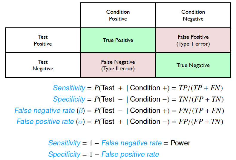
Classification Metrics from OpenIntro Statistics
Here is a nice way to illustrate these metrics graphically.
ggplot(pred, aes(spam_prob, spam_true)) +
  geom_jitter(height = 0.1, alpha = 0.5) +
  geom_vline(xintercept = 0.75, color = "red") +
  geom_hline(yintercept = 0.5, color = "red") +
  scale_y_continuous(breaks = c(0, 1)) +
  geom_text(label = "FN(354)", x = 0.35, y = 0.75, color = "red") +
  geom_text(label = "TP(13)", x = 0.85, y = 0.75, color = "red") +
  geom_text(label = "TN(3551)", x = 0.35, y = 0.35, color = "red") +
  geom_text(label = "FP(3)", x = 0.85, y = 0.35, color = "red") +
  labs(x = "Predicted Probability of Being Spam",
       y = "Spam")

ROC Simulation
Now, after examining these metrics with the probability threshold of 0.75, we can move forward with simulation of all possible probability thresholds.
metrics_fun <- function(cutoff) {
  pred %>%
    mutate(spam_pred = ifelse(spam_prob >= cutoff, 1, 0)) %>%
    summarize(cutoff = cutoff,
          TP = sum(spam_true == 1 & spam_pred == 1),
          FP = sum(spam_true == 0 & spam_pred == 1),
          TN = sum(spam_true == 0 & spam_pred == 0),
          FN = sum(spam_true == 1 & spam_pred == 0),
          sensitivity = TP / (TP + FN),
          specificity = TN / (FP + TN))
}
We simulate around 1000 possible values of probability thresholds and compute sensitivity and specificity metrics accordingly.
cutoff <- seq(0, 1, 0.001)

metrics <- cutoff %>%
  map(metrics_fun) %>%
  bind_rows()

metrics
#> # A tibble: 1,001 x 7
#>    cutoff    TP    FP    TN    FN sensitivity specificity
#>     <dbl> <int> <int> <int> <int>       <dbl>       <dbl>
#>  1  0       367  3554     0     0       1          0
#>  2  0.001   367  3444   110     0       1          0.0310
#>  3  0.002   366  3344   210     1       0.997      0.0591
#>  4  0.003   366  3232   322     1       0.997      0.0906
#>  5  0.004   366  3131   423     1       0.997      0.119
#>  6  0.005   365  3001   553     2       0.995      0.156
#>  7  0.006   362  2915   639     5       0.986      0.180
#>  8  0.007   362  2791   763     5       0.986      0.215
#>  9  0.008   362  2660   894     5       0.986      0.252
#> 10  0.009   359  2520  1034     8       0.978      0.291
#> # … with 991 more rows
With the metrics value in place, we can plot sensitivity, true positive rate, against 1 - specificity, false positive rate.
ggplot(metrics, aes(x = 1 - specificity, y = sensitivity)) +
  geom_line(color = "red") +
  geom_abline(linetype = "dotted", color = "grey50") +
  labs(x = "False Positive Rate", y = "True Positive Rate") +
  coord_equal()
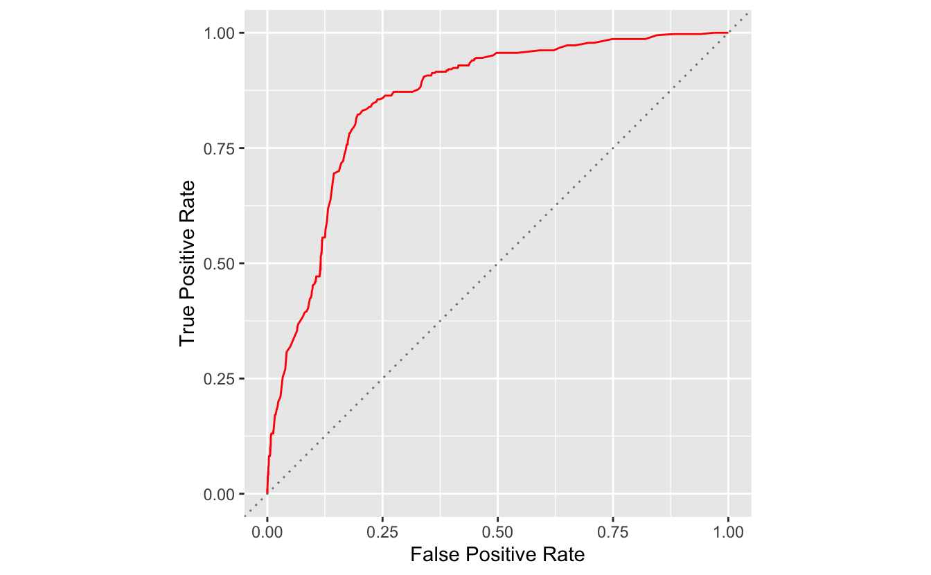
This plot is called ROC curve, which shows the trade off between sensitivity and specificity for all possible probability thresholds. ROC curve is a straightforward way to compare classification model performance. More specifically, the area under the curve (AUC) can be used to assess the model performance.
Tidymodels Approach
While simulation is a good way to understand the concepts of classification metrics, it is not convenient to plot ROC curve. In essence, R has some packages to do this automatically. For example, Tidymodels provides some tools such as roc_curve() and roc_auc() to plot ROC curve and calculate AUC.
# plot ROC Curve in tidymodels
pred %>%
  roc_curve(truth = factor(spam_true), spam_prob) %>%
  autoplot() +
  labs(x = "False Positve Rate", y = "True Positive Rate")
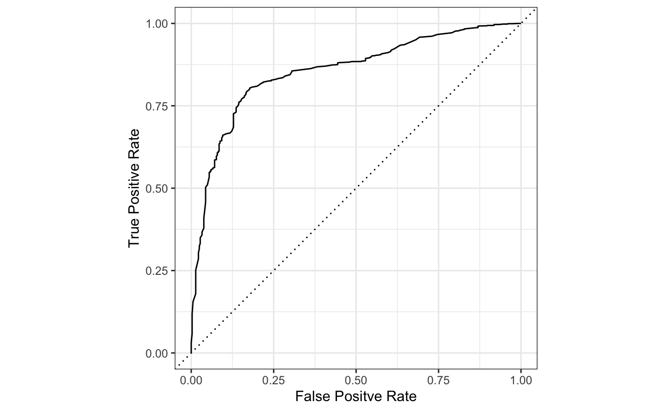
pred %>%
  roc_auc(truth = factor(spam_true), spam_prob)
#> # A tibble: 1 x 3
#>   .metric .estimator .estimate
#>   <chr>   <chr>          <dbl>
#> 1 roc_auc binary         0.855