In my last post about ggplot2 (ggplot2 Theme Elements Demonstration), I showed how to identify ggplot2 theme elements graphically. I did not expect that so many people like it when I shared it on Twitter and I feel so glad that it helps.
Today I want to share with you another useful way I found to learn ggplot2, which is learning ggplot2 with pen and paper. I got this idea a few days ago when I was trying to review the underlying grammar behind ggplot2 and just realized how similar it is to the way I drew math function graphs on paper in middle school. Let me show you how they are related and why it is a useful way to learn ggplot2.
First, please forget about ggplot2. Instead, prepare a pen and a piece of paper on the desk. I am sure you will have a better understanding of the components of ggplot2 grammar in a few minutes if you follow the following steps.
Table of Contents
Draw a Graph on Paper
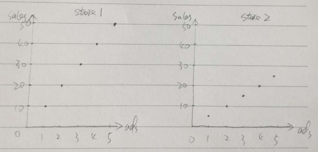
Recall that in middle school we were often asked to draw a graph based on some data points and let’s start from there. Below is a dataset a store manager collected
| ads | 1 | 2 | 3 | 4 | 5 |
| sales | 10 | 20 | 30 | 40 | 50 |
Before continue, now please draw a graph to show the relationship between the number of ads and store sales. Once you are done, can you recall the steps you took to draw the graph? Below are my steps and feel free to check them with yours.
Step 1: Prepare Data
The raw data is already shown above. Again, there is no data frame or tibble here and it is just 5 pairs of numbers corresponding to the number of ads and store sales.
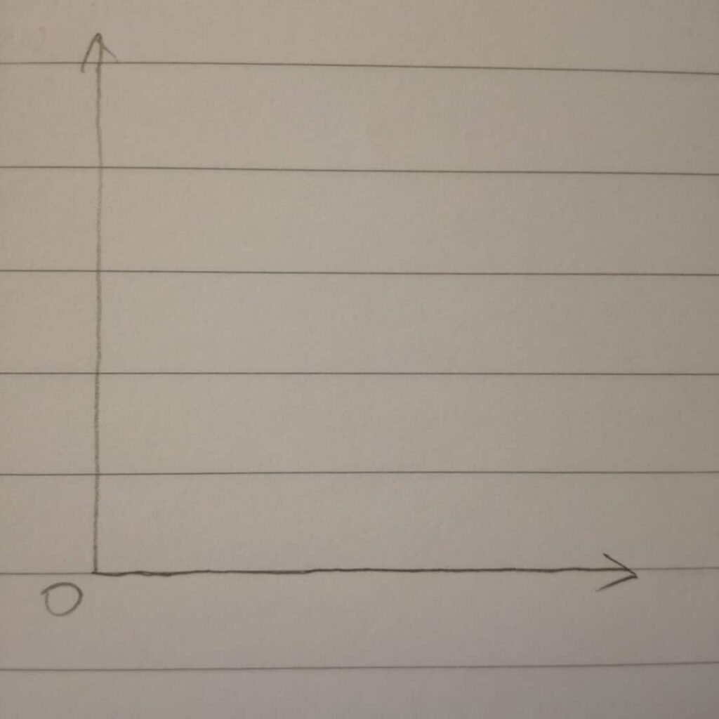
Step 2: Draw Coordinate System on Paper
Back in middle school I guess we only know Cartesian Coordinate System, with x-axis on the horizontal line and y-axis on the vertical line.
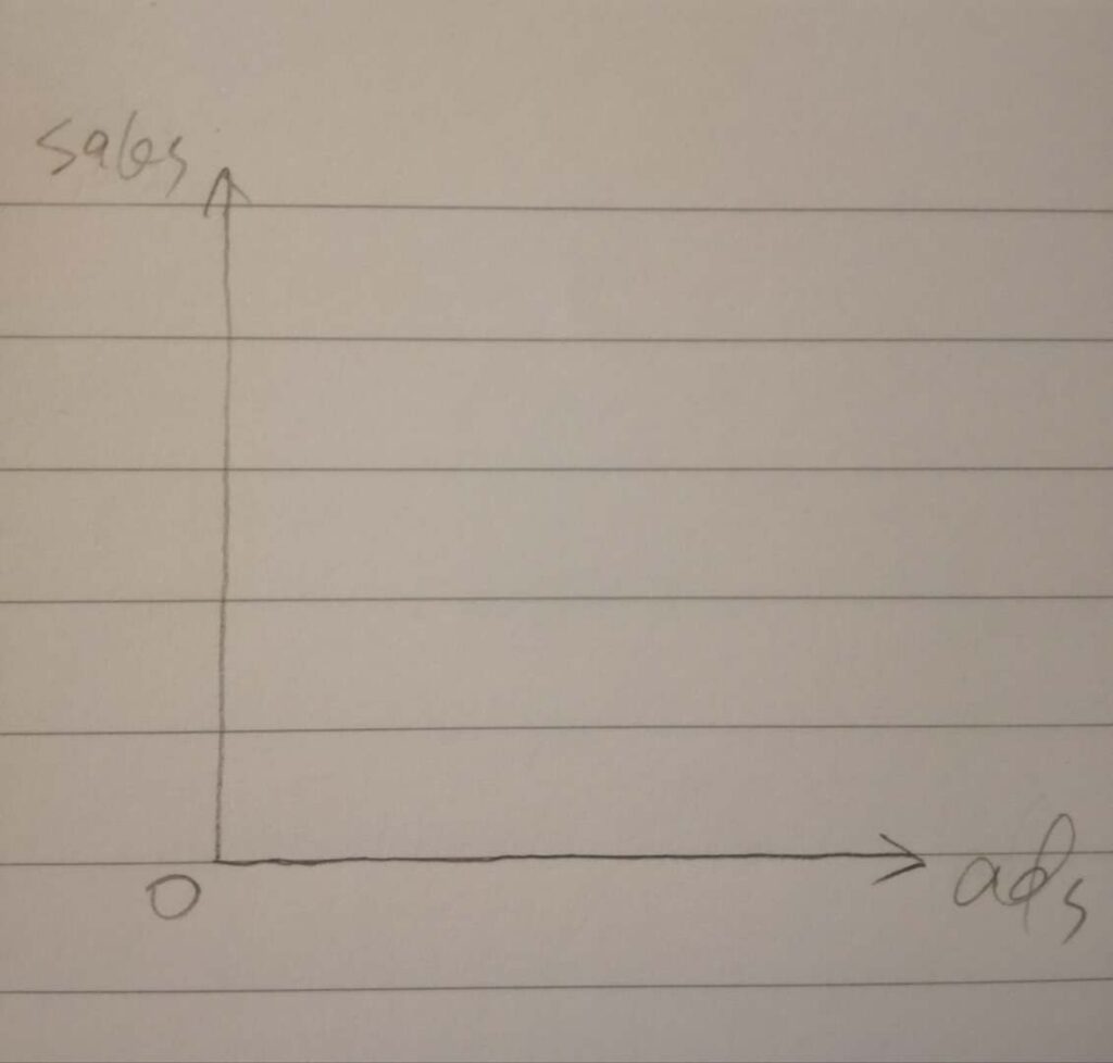
Step 3: Mapping Data to Axes
Mapping “ads” to x-axis and mapping “sales” to y-axis.
Step 4: Draw Breaks on Axes
This is the tricky part. You may like me that did it automatically without thinking why we did it that way because we are already very familiar with it.
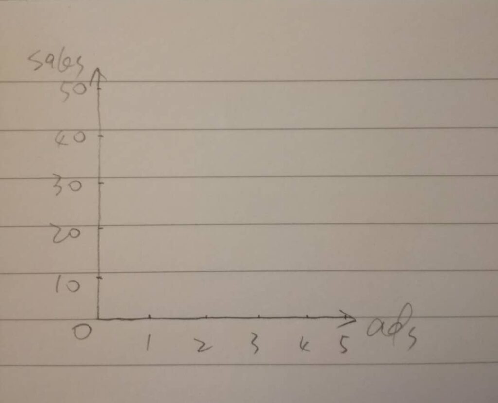
Here is what I did: the “ads” values range from 0 (the origin) to 5, so I tried to divide the whole x-axis into 5 equal units. Similarly, “sales” values range from 0 to 50, I divided the whole y-axis into 5 equal units.
Please note that one unit of x-axis is 1 while one unit of y-axis is 10 because the range of “sales” values is much higher than that of “ads” value. The graph would look better in this way.
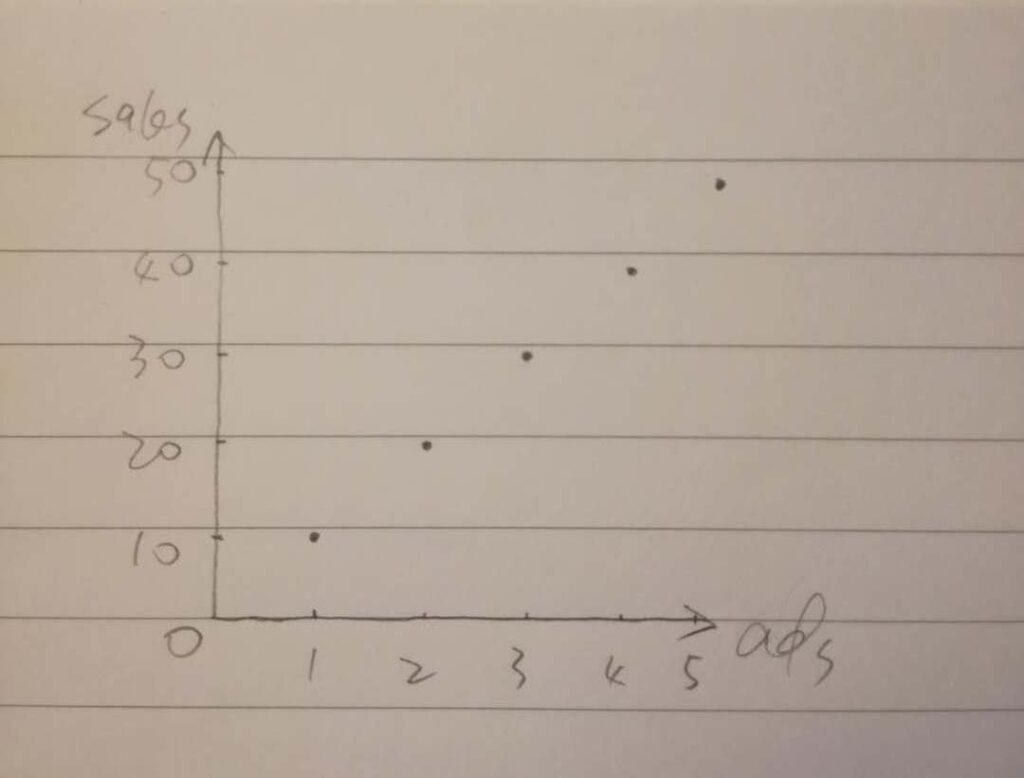
Step 5: Draw Points
Finally, draw the pairs of numbers, (1, 10), (2, 20) etc, with points on the paper.
So far, the job is done and you probably could have got the full mark in the middle school, but let’s move a bit forward.
Step 6: Draw Another Graph
Suppose the store manager collected another dataset from the second store and is shown below.
| ads | 1 | 2 | 3 | 4 | 5 |
| sales | 5 | 10 | 15 | 20 | 25 |
In order to compare the patterns for the two stores, we draw another graph with the same scales on axes and put the two graphs side by side.
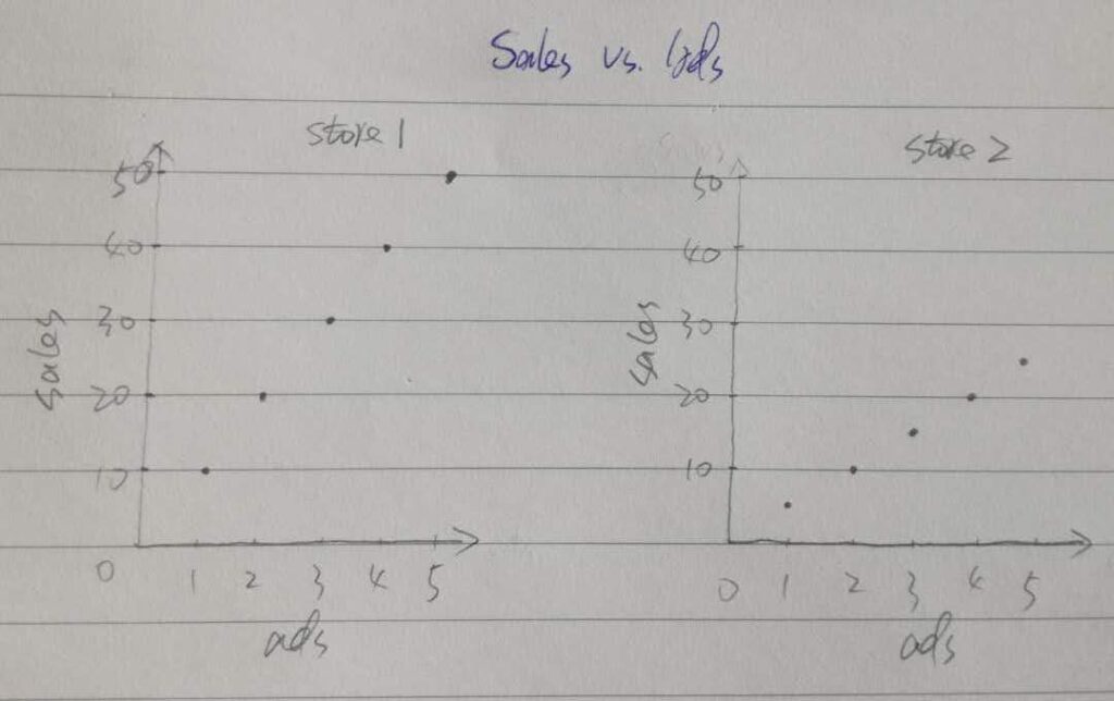
Step 7: Tweak the Graphs
Now, before we complete it, let’s tweak the graphs a bit. We moved the axis titles in the middle of each axis instead of near the arrow end. Furthermore, we name the two graphs with another pen at the top, as shown below.
Back to ggplot2
ggplot2 Components
If you had similar steps as I did above, you actually have already covered all the components of ggplot2:
| Draw a Graph on Paper | ggplot2 Components |
|---|---|
| Step1: Prepare Data | Data |
| Step 2: Draw Coordinate System on Paper | Coordinate System |
| Step 3: Mapping Data to Axes | Mapping |
| Step 4: Draw Breaks on Axes | Scale |
| Step 5: Draw Points | Layer |
| Step 6: Draw Another Graph | Facet |
| Step 7: Tweak the Graphs | Theme |
Just like how you drew a graph on paper, you need to provide ggplot2 with the following information:
- Data: the default data you are plotting
- Coordinate System: the default one is the Cartesian Coordinate System
- Mapping: the default mapping from variables to aesthetics (e.g., x-axis, y-axis, color)
- Scale: often done automatically behind the scene
- Layers: most importantly what geometric objects you want (e.g., point layer, line layer)
- Facet: you may want to plot different groups of data in one plot
- Theme: the plot template or style you want to customize
Plot a Graph in ggplot2
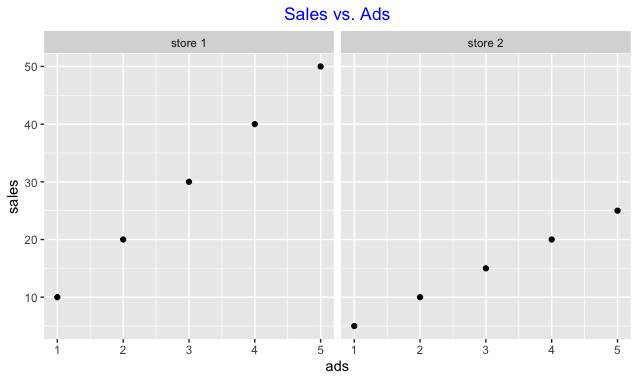
Now, let’s plot a “similar” graph in ggplot2.
# Prepare data in R
data1 <- tibble(ads = 1:5, sales = seq(10, 50, 10), store = "store 1")
data2 <- tibble(ads = 1:5, sales = seq(5, 25, 5), store = "store 2")

data <- data1 %>% bind_rows(data2)

# Plot final graphs
# Default Scale and Coordinate System are behind the scene
p <-
  ggplot(data = data, aes(x = ads, y = sales)) +
  geom_point() +
  facet_grid(.~store) +
  labs(title = "Sales vs. Ads") +
  theme(plot.title = element_text(hjust = 0.5, colour = "blue"))

p
All the information you provide with ggplot2 can be examined in the ggplot2 object if you are interested.
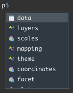
For example, the mapping information below shows that “ads” is mapped to x-axis, “sales” to y-axis.
> p$mapping
Aesthetic mapping:
* `x` -> `ads`
* `y` -> `sales`
Final Note
This post shows you how to understand ggplot2 components with pen and paper. This is just to give you a general idea about ggplot2 components and each component will be explained in this way on paper in the next few posts. Meanwhile, you can check my previous post about ggplot2 theme component.
I also recommend you check Hadley Wickham’s book (https://ggplot2-book.org) and his PhD thesis (http://had.co.nz/thesis).