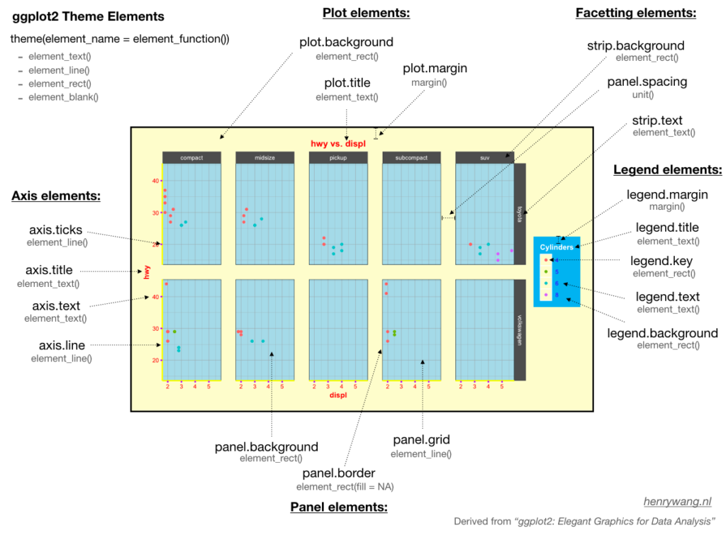
ggplot2 is one of the most powerful packages in r for data visualizations and it is essential to master the underlying grammar of graphics to fully utilize its power. While the theming system of ggplot2 allows you to customize the appearance of the plot according to our needs in practice, it is always a frustration to identify the elements on the plot you want to change as you may find it difficult to remember the element names and their corresponding functions to modify, at least this is the case for me.
As such, after consulting ggplot2 references (e.g., the book from Hadley Wickham, “ggplot2: Elegant Graphics for Data Analysis”), I create the demonstration below to help identify theme elements and functions.
You can also download the PDF version:
Please note that, as @ClausWilke mentioned, the elements inheritance is not included in the graph. For example, axis.text.x and axis.text.y are inherited from axis.text and therefore element_text() also works for them. As such, I would suggest you check the details in the theme function (?theme) when you doubt it.
Besides, the remaining part of the post will show you how to customize ggplot2 theme elements step by step.
Table of Contents
Preparation
# Load package
library(tidyverse)
# Data preparation
mpg.df <- mpg %>%
filter(class != "2seater", manufacturer %in% c("toyota", "volkswagen"))
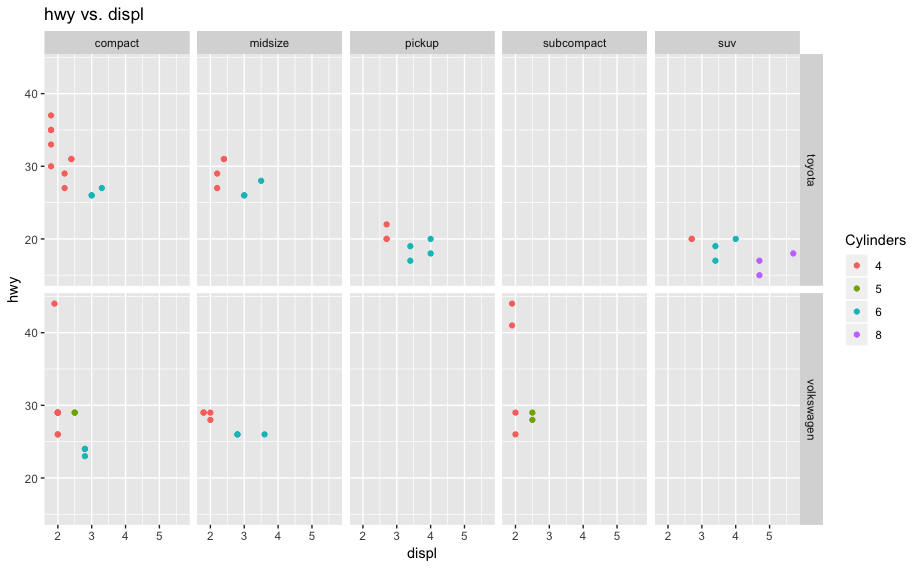
# Base plot
p <- ggplot(mpg.df, aes(displ, hwy, color = factor(cyl))) +
geom_point() +
facet_grid(manufacturer ~ class) +
labs(title = "hwy vs. displ", colour = "Cylinders")
p
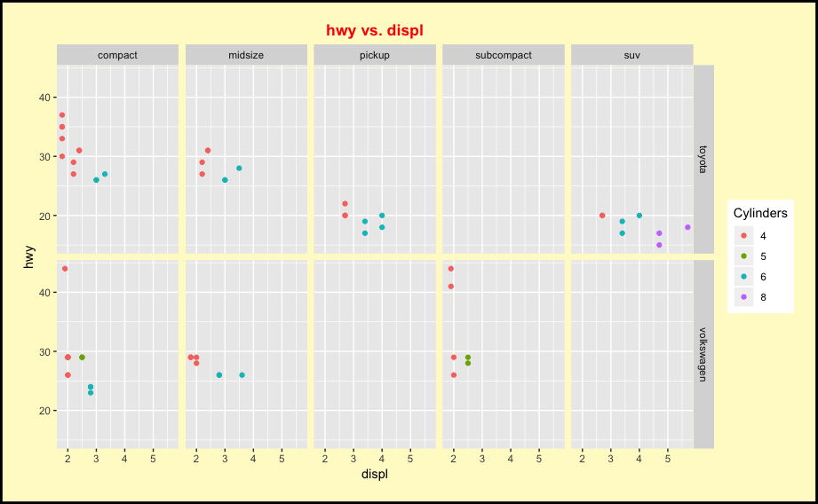
Plot Elements
# 1. Plot elements
p1 <- p + theme(plot.background = element_rect(fill = "lemonchiffon", colour = "black", size = 2),
      plot.title = element_text(hjust = 0.5, colour = "red", face = "bold"),
      plot.margin = margin(20, 20, 20, 20))

p1
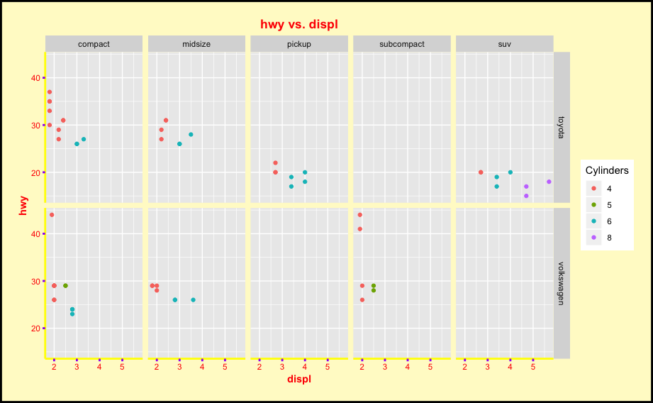
Axis Elements
# 2. Axis elements
p2 <- p1 + theme(axis.line = element_line(colour = "yellow", size = 1),
      axis.text = element_text(colour = "red"),
      axis.title = element_text(face = "bold", colour = "red"),
      axis.ticks = element_line(colour = "purple", size = 1))

p2
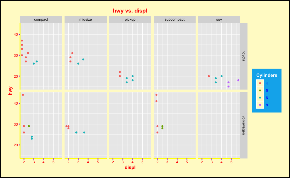
Legend Elements
# 3. Legend elements
p3 <- p2 + theme(legend.background = element_rect(fill =  "deepskyblue2"),
      legend.key = element_rect(fill = "lemonchiffon"),
      legend.title = element_text(colour = "white", face = "bold"),
      legend.text = element_text(colour = "blue"),
      legend.margin = margin(10, 10, 10, 10))

p3
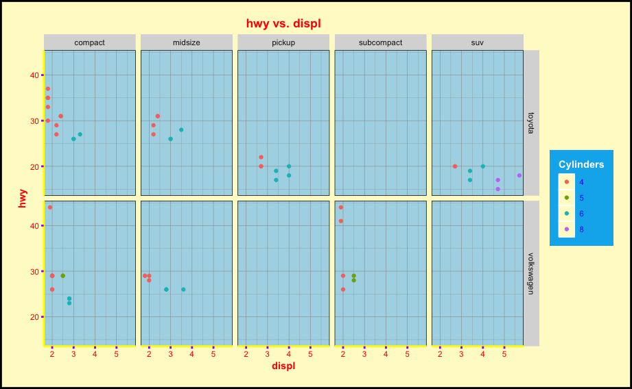
Panel Elements
# 4. Panel elements
p4 <- p3 + theme(panel.background = element_rect(fill = "lightblue"),
      panel.grid = element_line(colour = "grey60", size = 0.2),
      panel.border = element_rect(colour = "black", fill = NA))

p4
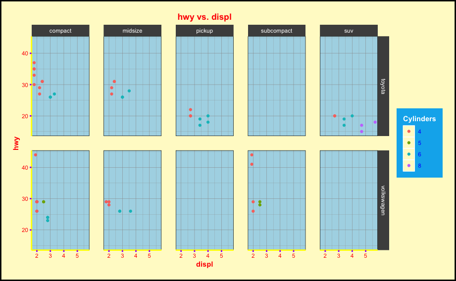
Facetting Elements
# 5. Facetting elements
p5 <- p4 + theme(strip.background = element_rect(fill = "grey30"),
      strip.text = element_text(colour = "white"),
      panel.spacing = unit(0.3, "in"))

p5
Final Notes
As you can see from the example, to modify an individual element on the plot, just follow the argument: theme(element.name = element function()). The final plot in the example is not necessarily pretty as I made it easier to identify the corresponding elements. Please let me know if it helps.
I firmly believe that “if you can visualize it, you can understand it”. I like to understand abstract concepts with the help of visualiz
تخضع تجهيزات مصنع إيليت بايب Elite Pipeلعمليات مراقبة جودة صارمة للتأكد من أنها تلبي متطلبات الأداء والمتانة الأكثر صرامة.