The previous two posts in this series of learning ggplot2 on paper:
This post will continue to discuss another ggplot2 component, Scale. Let’s start with the graphs we drew in the last post of “Learning ggplot2 on Paper – Layer“, as shown here.
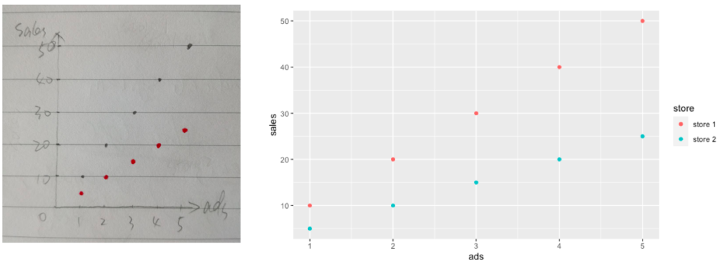
The left graph was drawn on paper while the right one was plotted in ggplot2 and the code in the last post is shown here again:
# Prepare data in R
data1 <- tibble(ads = 1:5, sales = seq(10, 50, 10), store = "store 1")
data2 <- tibble(ads = 1:5, sales = seq(5, 25, 5), store = "store 2")
data <- data1 %>% bind_rows(data2)

# Attributes within aes()
p2 <- ggplot(data = data, aes(x = ads, y = sales, color = store)) +
  geom_point()

p2
If we are picky about the color in the right graph as they are not exactly the same as what we wanted, black and red, we need to know how to change them, which means we need to know how Scale in ggplot2 works.
Scale vs. Mapping
As we discussed in the last post, in short, mapping controls how visual elements on the plot are related to our data. More specifically, mapping controls which data variable is related to one specific layer attribute (e.g., x, y, color).
Afterward, scale controls what exactly the visual elements on the plot look like by assigning appropriate values to each layer attribute (aesthetic). This also means that each attribute (aesthetic) of the visual elements has one corresponding scale.
For example, scale assigns default values to the point color aesthetic in Figure 1, points of store 1 with the color of “#F8766D” and points of store 2 with the color of “#00BFC4”.
Check the book of Hadley Wickham (https://ggplot2-book.org) for more information about why the color has those two values if you are interested, but more importantly, we need to know how to change those values accordingly.
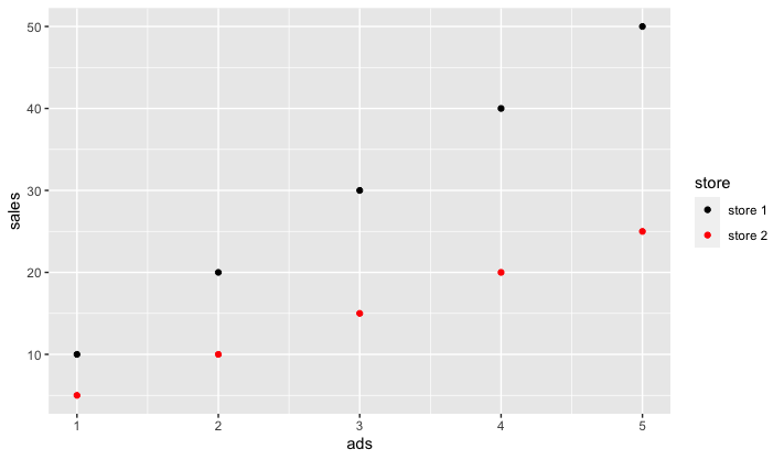
In our case, the scale function is scale_color_manual() and we can assign our color values to the values argument. The code example is shown here:
# Prepare data in R
data1 <- tibble(ads = 1:5, sales = seq(10, 50, 10), store = "store 1")
data2 <- tibble(ads = 1:5, sales = seq(5, 25, 5), store = "store 2")
data <- data1 %>% bind_rows(data2)

# Change Points Color
p3 <- ggplot(data = data, aes(x = ads, y = sales, color = store)) +
  geom_point() +
  scale_color_manual(values = c("black", "red"))

p3
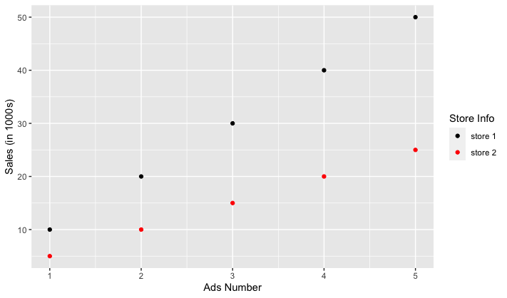
Scale vs. Theme
You may notice that the plot in Figure 2 automatically generated a legend for us. This is done by scale and actually scale automatically generates appropriate axes and legend for each aesthetic. Again, we need to know how to change those default values. One solution is to do it in each scale function, as shown below:
# Change Axes and Legend
p4 <- ggplot(data = data, aes(x = ads, y = sales, color = store)) +
  geom_point() +
  scale_x_continuous(name = "Ads Number") +
  scale_y_continuous(name = "Sales (in 1000s)") +
  scale_color_manual(name = "Store Info", values = c("black", "red"))

p4
It’s useful to know how to change axes and legend names in this way but most often you could use helper functions such as labs() or even
p5 <- ggplot(data = data, aes(x = ads, y = sales, color = store)) +
  geom_point() +
  scale_color_manual(values = c("black", "red")) +
  labs(x = "Ads Number",
       y = "Sales (in 1000s)",
       color = "Store Info")

p5
Besides how to change the default values generated by scale functions, the next thing probably is to customize the style of those elements. You can check how to do it in my other post about theme elements: ggplot2 Theme Elements Demonstration”.
BWER Company provides Iraq’s leading-edge weighbridge solutions, designed to withstand harsh environments while delivering top-tier performance and accuracy.